-
I conducted in-depth user research, collaborating directly with library staff to gather valuable input from those who interacted with our services daily. This approach ensured that our rebranding efforts were aligned with their experiences and met the needs of both the internal and external library community.
Lincolnwood Library Rebrand
Problem:
The old logo lacked meaning for both our staff and visitors, and its usability on social media and our website was problematic.
Solution:
Design a logo that seems reliable, as the library offers a wide range of resources for the community, and that can last for a long time.
Deliverables:
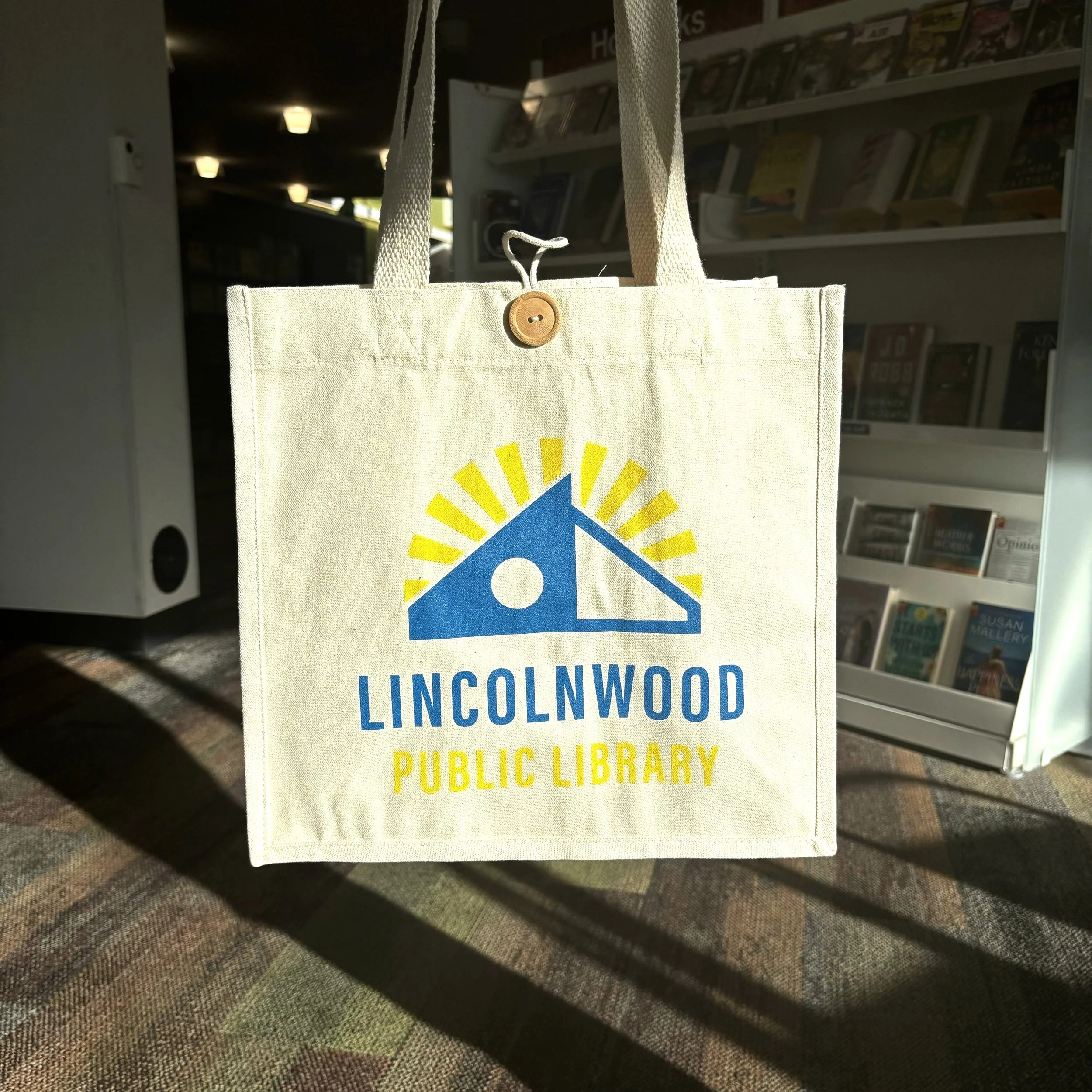
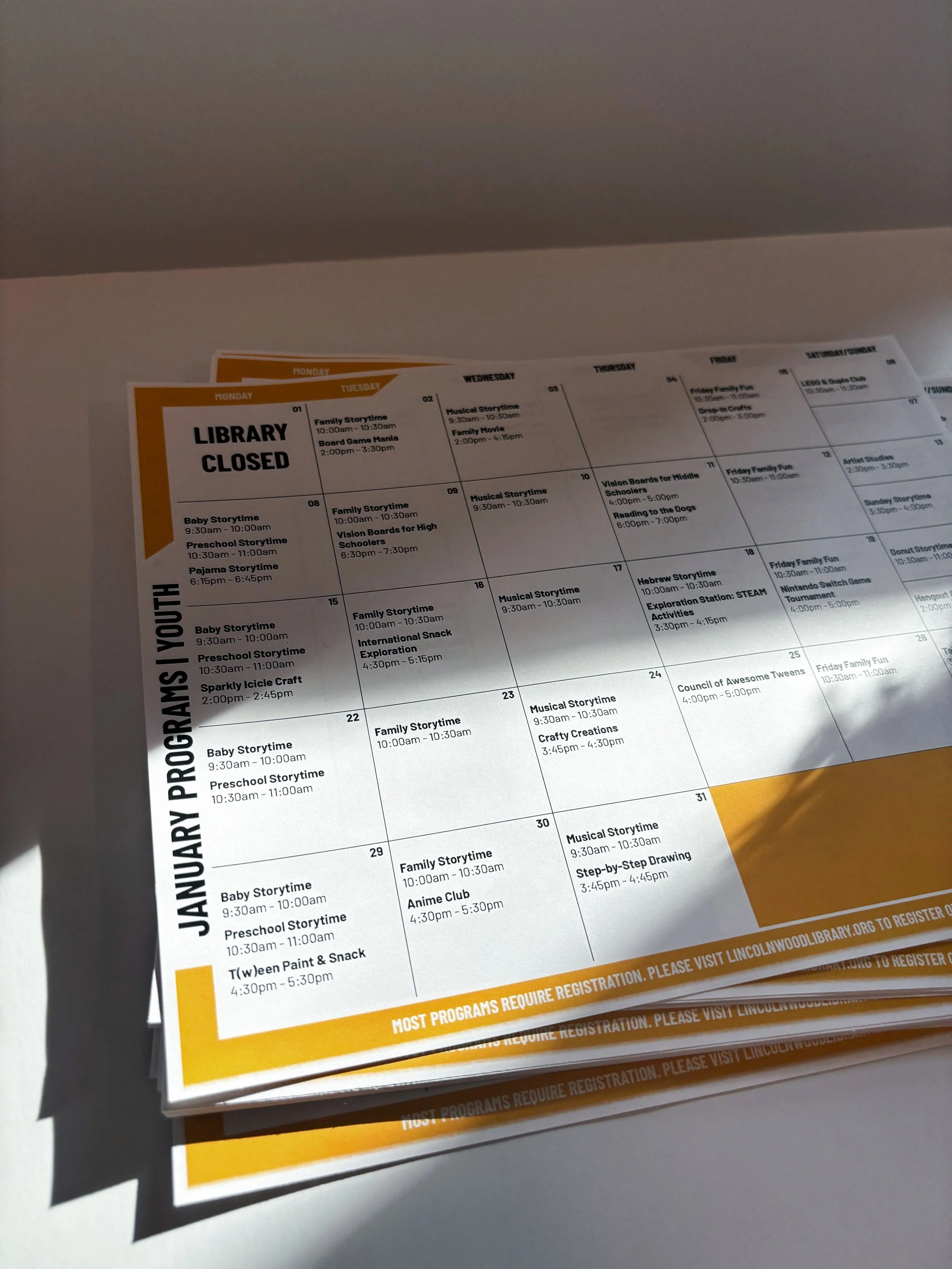
Logo | Collateral | Merchandise | Newsletter | Poster Templates | Social Media
Software Used:
Illustrator | Photoshop | Figma
Links:
Newsletter→
Before
After
Our research included talking to library staff, board members, and patrons about what they thought of the old logo. We got great feedback, which helped us come up with descriptive attributes. We looked at other library logos around the area and most of them were a books, so we knew we wanted to stray away from that, since most libraries aren’t only books now.
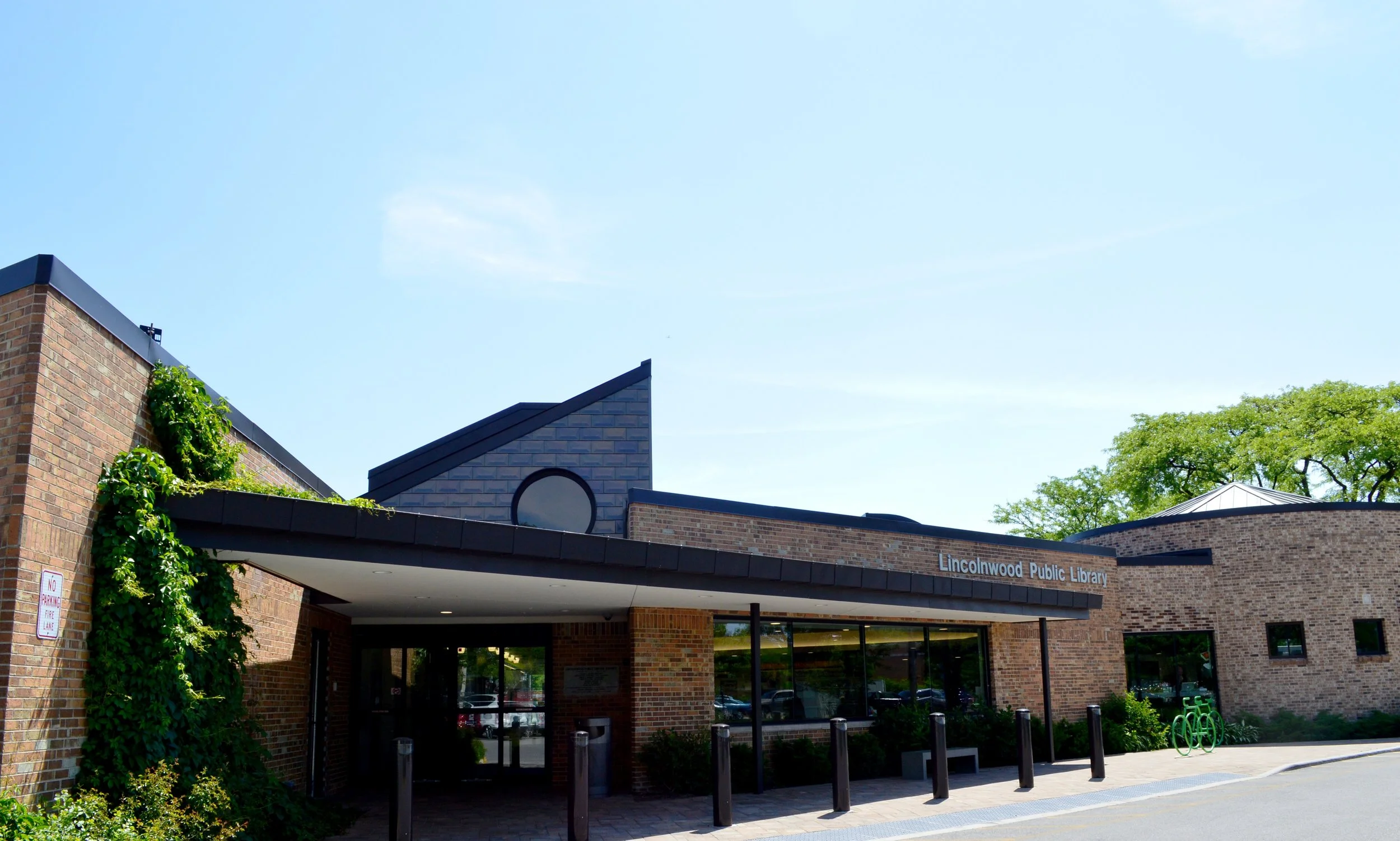
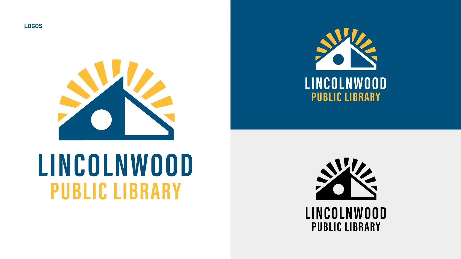
The logo gets its shape from the architecture of the building. We wanted to keep the same blue the old logo had, so patrons could see the similarities in the current logo. The sun rays allude to the library being an array of resources.


